Account Summary Customization
Overview
The customization effort for the Account Summary page was launched to meet Wells Fargo customers' desire to make their own selections and setting preferences. Through an iterative process, a simple customization design was achieved that gave customers full control on how their information was organized or displayed.
My Role
My primary responsibilities were to lead and represent a design team of 4, ideate, create personas, wireframes & prototypes.
Direct & Indirect Competitive Analysis
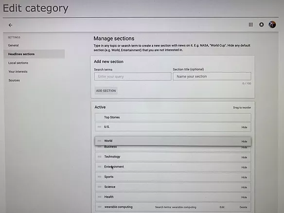
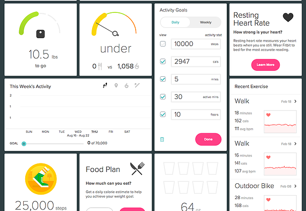
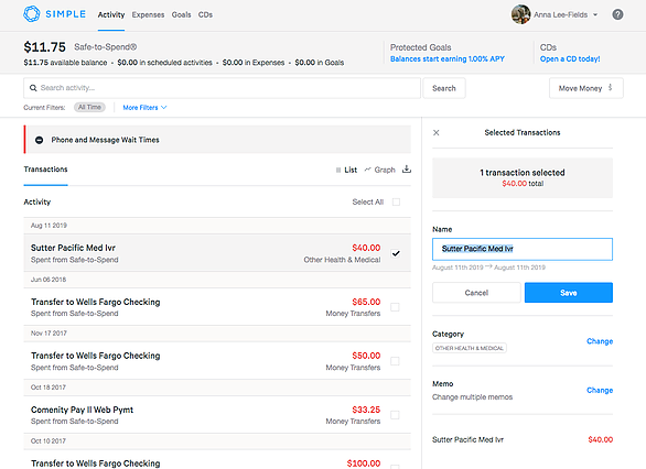
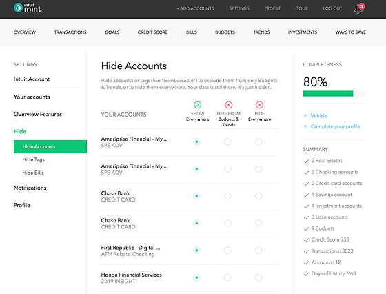
Not too many direct competitors provided customization for their online banking, so we looked at indirect competitors as well that featured customization for their dashboard or homepage.
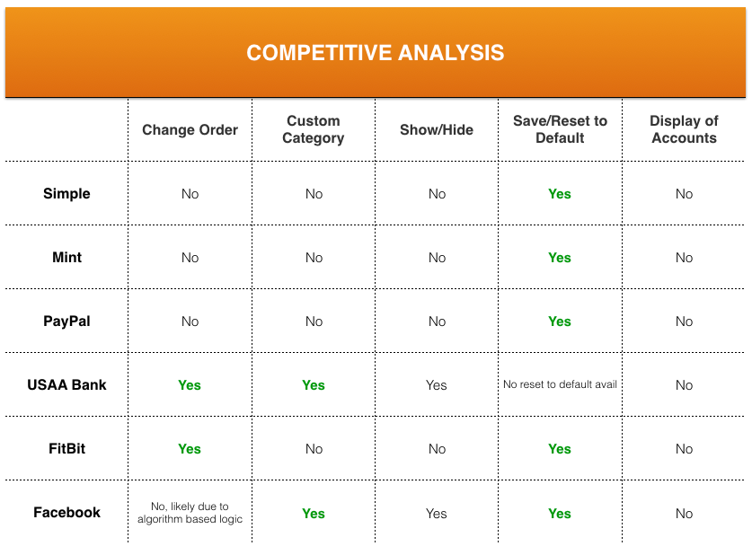
USAA
Google News
FitBit
Simple Bank
PayPal

Mint
Brainstorming & Working Sessions
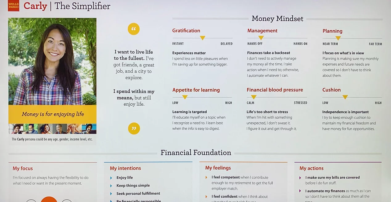
Next, my team and I rolled our sleeves up, grabbed markers and sketched out ideas on giant whiteboards. We also looked at two distinct Wells Fargo personas to understand our customer segments that could benefit from the customization feature.
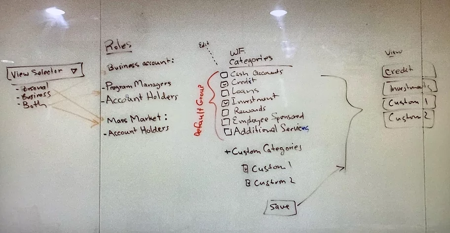

Personas
Bringing Our Concept to Life
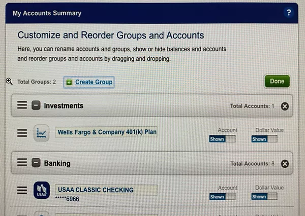
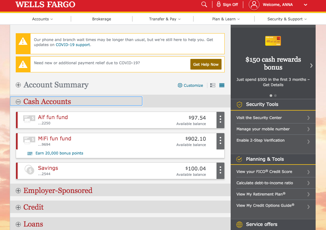
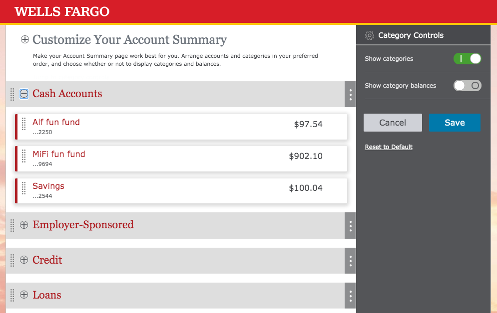
Account Summary
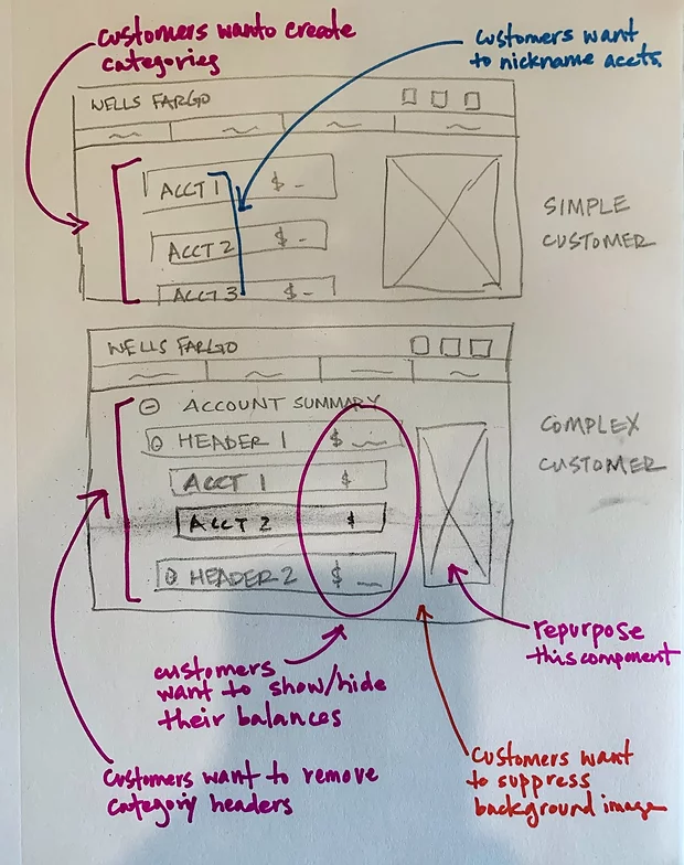
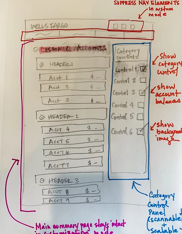
Customization Page
Usability Test Findings
There were many rounds of usability testing to ensure our design iterations evolved based on participants' feedback and reaction. For example, we learned that iconography alone did not stand out enough (the gear icon), which led us to complementing it with a label 'Customize'. Another finding was that participants appreciated having a centralized place to set preferences, and common feedback was to add task related features to this customization page as well, such as paying bills, transferring money, etc. As a result, we intentionally designed the Category Controls panel that houses the custom controls to be scalable, in addition to the controls being easily scannable.
Lessons Learned
The key takeaway from this project was that competitive and comparative analysis is a meaningful exercise to carry out when designing a new concept. But more importantly, I've learned that inspirations can be generated from unexpected places - for 'Account Summary Customization', I got many good ideas from those who provided customization for their users (USAA Bank, Mint, Google News, etc.), but ultimately our final design derived from a standard photo editing practice. More specifically, when an edit function is triggered to manipulate a photo (brighten, increase/decrease saturation, etc.), typically the photo stays in place and the editing controls appear, preventing the user from going somewhere else to complete the task. Here are two images that illustrate our inspiration.
Customization of a photo: 'Edit' link on top right triggers the customization mode