
Smartphone Navigation Redesign
Overview
The goal of this project was to conduct a thorough heuristic evaluation of the Wells Fargo smartphone app and browser navigation system in an effort to address customer navigation pain points. The redesign was for secure session that spanned across all customer segmentation, and in one year, this project helped customers navigate with efficiency and ease of use.
My role
My primary responsibilities were co-leading and collaborating with a design team of 5 on identifying issues, conducting competitive analysis, creating & refining wireframes/prototypes and supporting the execution delivery team.
Customer Pain Points
Customers found the navigation to be inefficient and hard to use due to a complex navigation system.
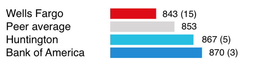
JD Power 2019 U.S. Mobile Banking App Satisfaction study - Wells Fargo navigation satisfaction was ranked #15 of 21
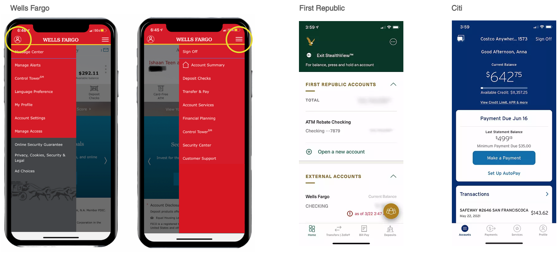
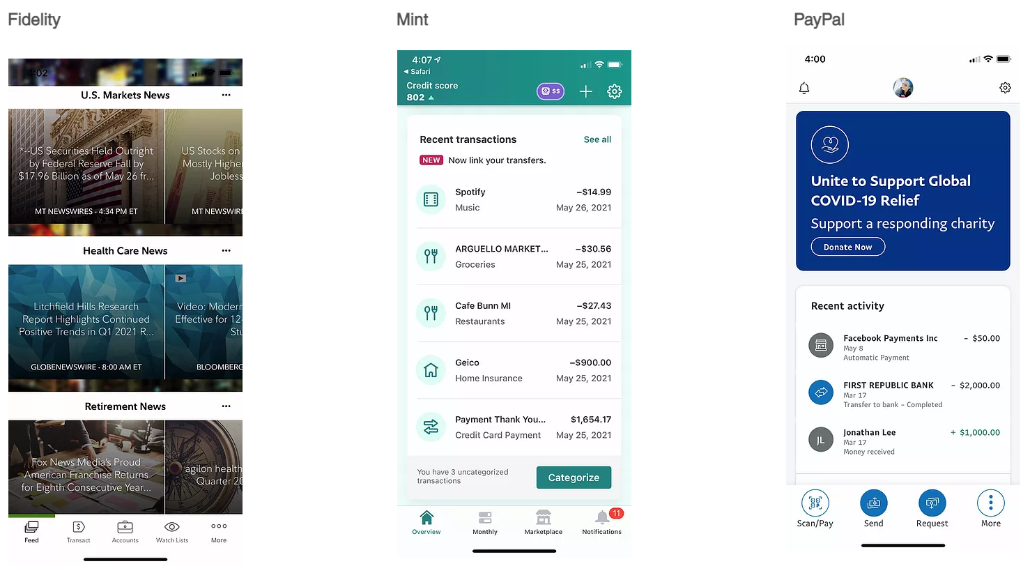
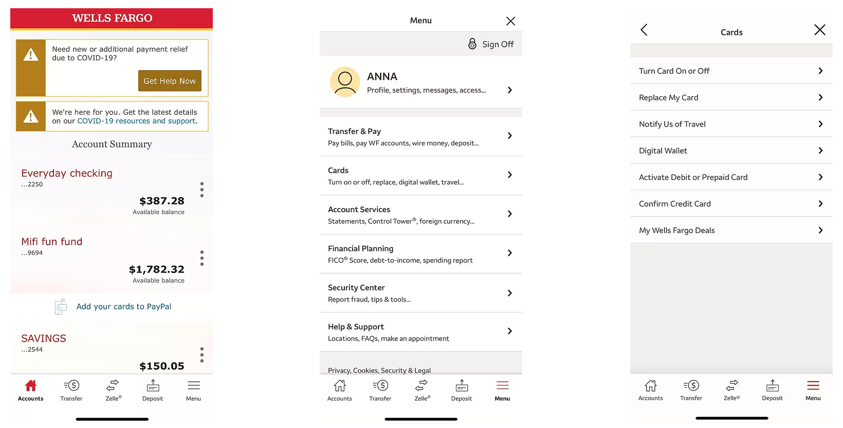
Key competitive navigation insights
- Persistent bottom navigation bar is common
- Many provide contextual navigation to specific money movement features
- Several banks surface high-frequency tasks
- Many offer menus that are well organized with predictable and differentiated groups
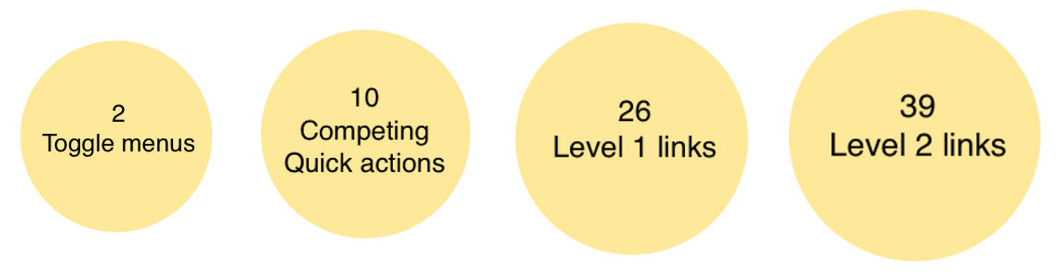
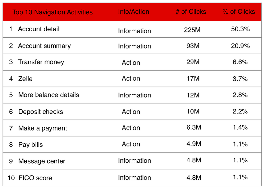
Many of customers' most common tasks were not surfaced in the top line (L1) navigation.
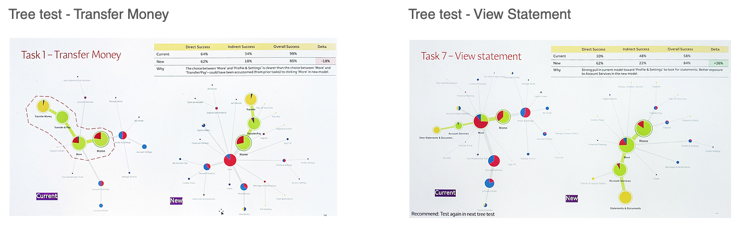
Usability testing
In order to ensure that the refinements made to the concepts resonated positively with the users, there were multiple rounds of usability testing. We formulated a single journey through the site that incorporated various scenarios - go deep in experience and see how they move back, and the journeys included top tasks such as Transfer, Zelle, Deposit Checks, Sign-off, Turn Card On or Off, and View Statements. Participant profile throughout usability testing was such that:
- They were all WF customers (various customer segments, mass market, brokerage, mortgage only, credit card only, etc)
- All must be online banking customers who use mobile devices
- There was a mix of Android & iOS users
Our learning goals were:
- Observe - customer reaction to BNB
- Explore - some of the top tasks and observe interaction between the menu systems in the BNB
- Observe - does the BNB interfere with find-ability?
- Observe - does the BNB improve find-ability?
- Ask - what are their impressions of the items inside the BNB (overall organization of the BNB)?
Potential solutions
Task-centric concept: Convenient access to top common tasks
Task-centric | Hub-centric concept
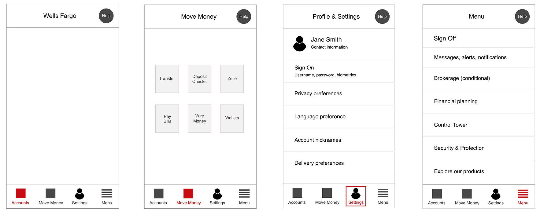
- Highlights move money as a hub
- Improves discoverability of new features within a hub
- Simplies the BNB
- Easy access to personal account & device settings
- Must invoke hub to access top tasks (extra step)
- May not be optimal for some segments (mortgage only customers)
Account Summary contextual navigation
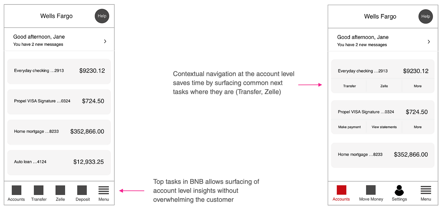
Concept to Production - Streamlined navigation system
Lessons learned
Throughout this project, it became clear that mobile navigation must be accessible, discoverable, and there must be a way to enter a task flow as well as to exit the flow. Curating the top tasks based on available data and organizing them in a way that helped users complete them with ease and efficiency was our ultimate objective, and I'm happy to say that we exceeded that goal. Our target was to raise the baseline of 56% on discoverability and satisfaction to at least 85%. The navigation redesign work was released in late 2020, and based on customer reviews, metrics, and KPIs, the latest discoverability and satisfaction rating is at 97% for mobile navigation. During this project, the importance of testing was confirmed, as that was a key contributor to making refinements in a true user-centered-design iterative process.